/formosa airlines
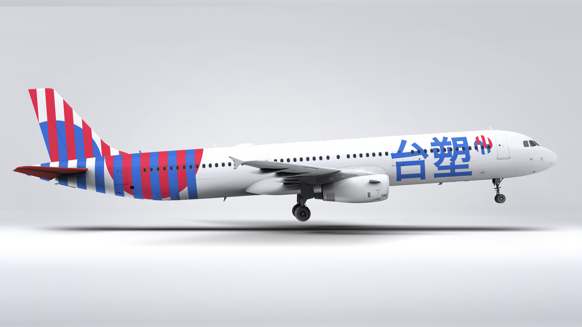
This project consisted on the design of the visual identity for the national airline of our own, fictional country: Ping-Heng (originally the city of Taipei).
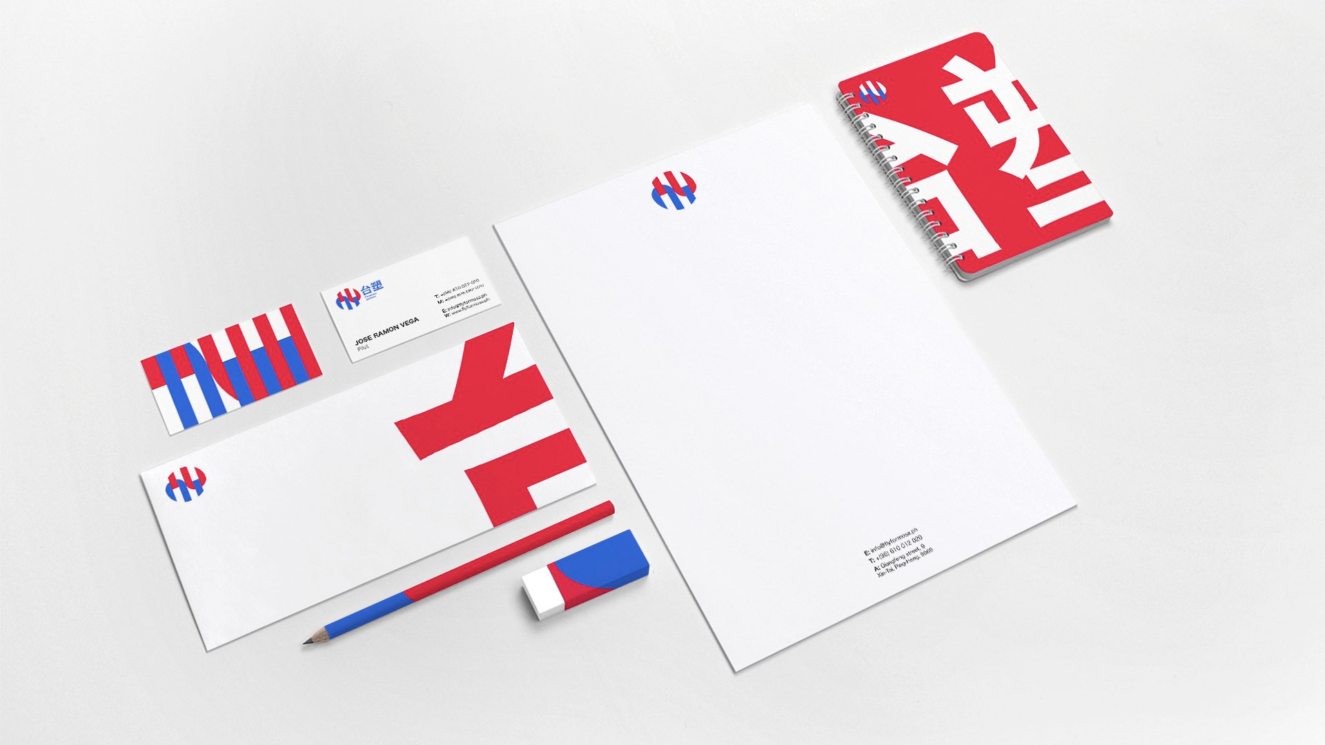
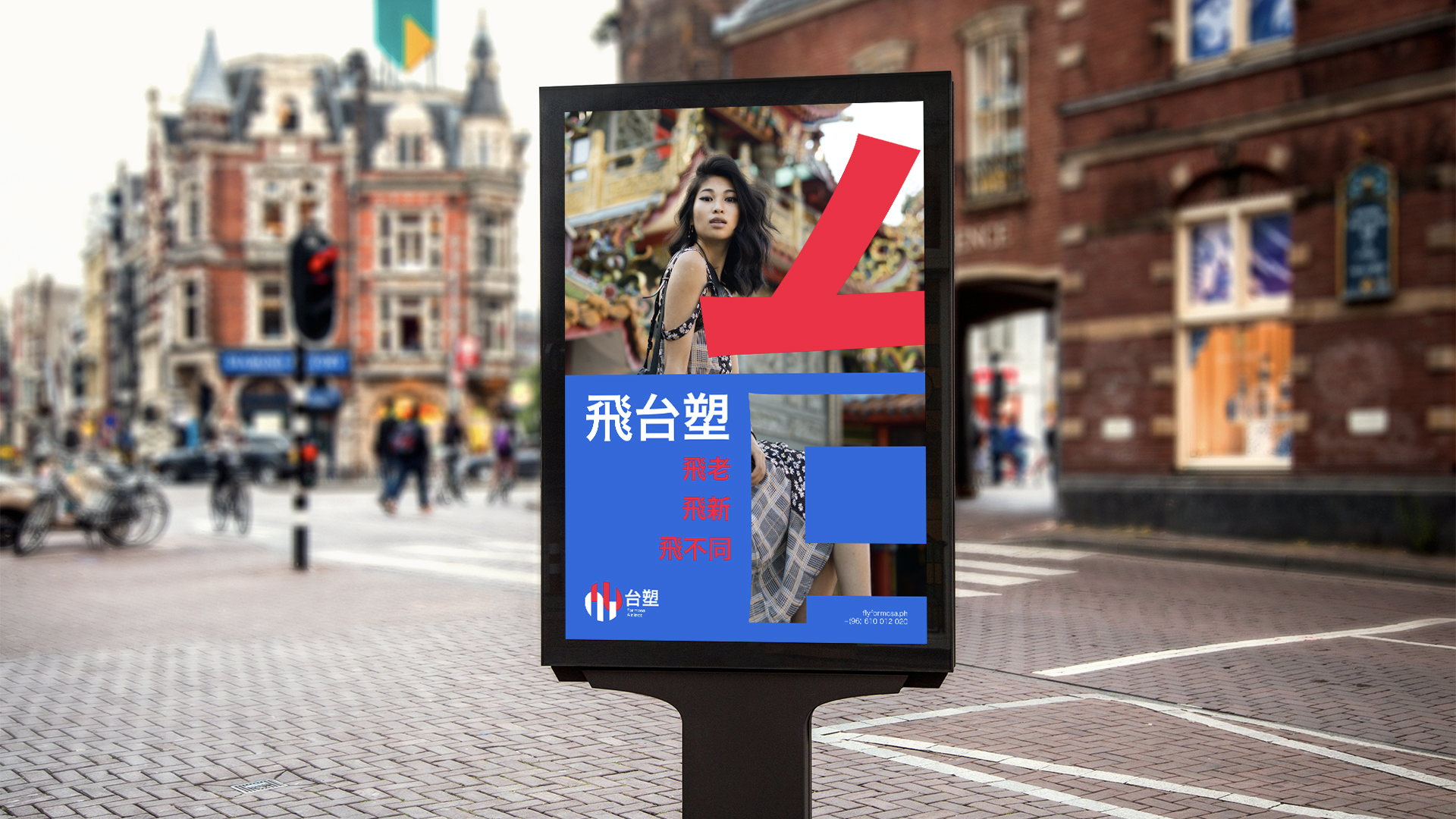
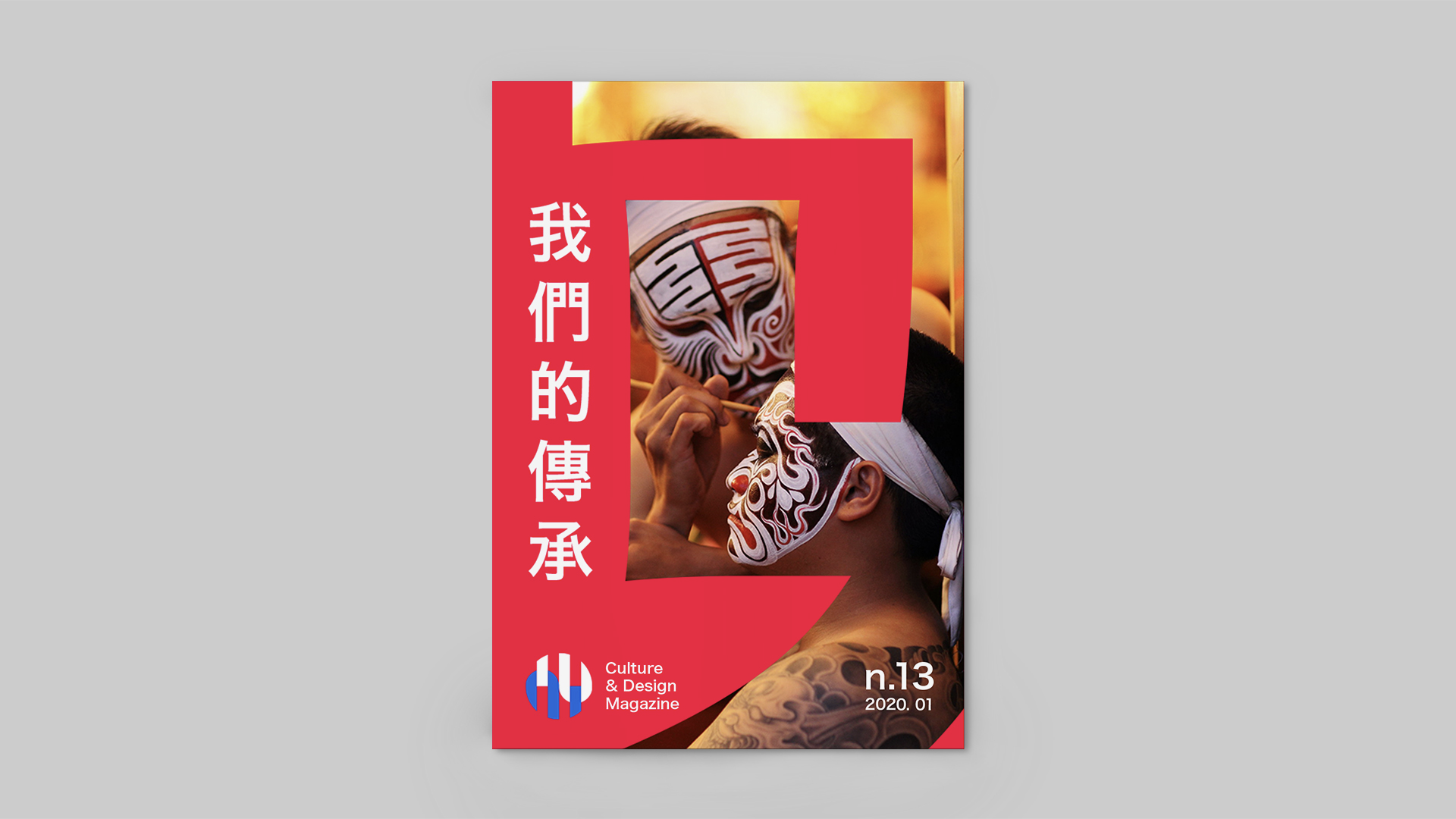
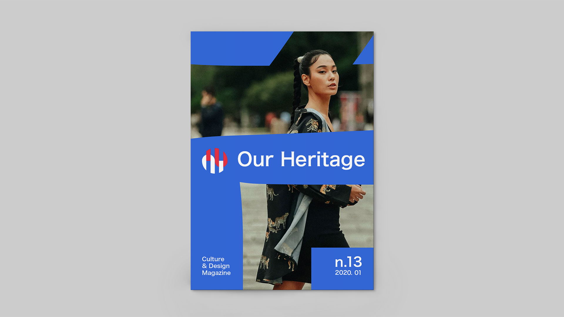
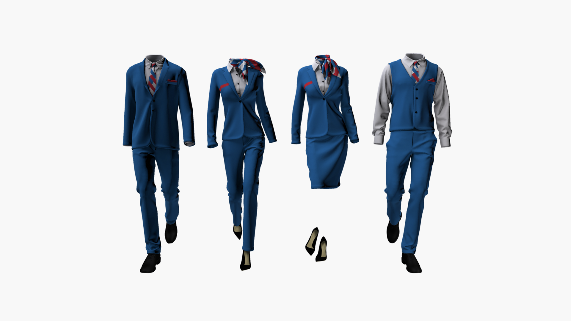
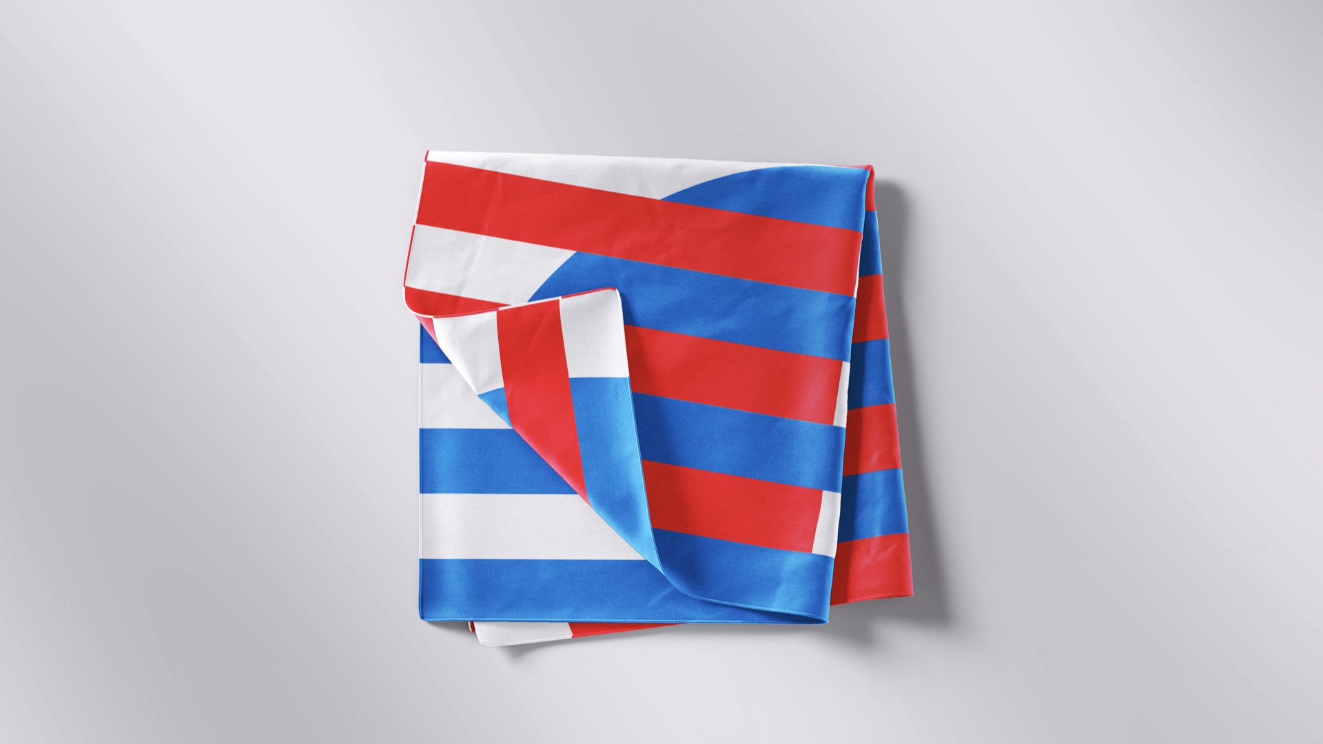
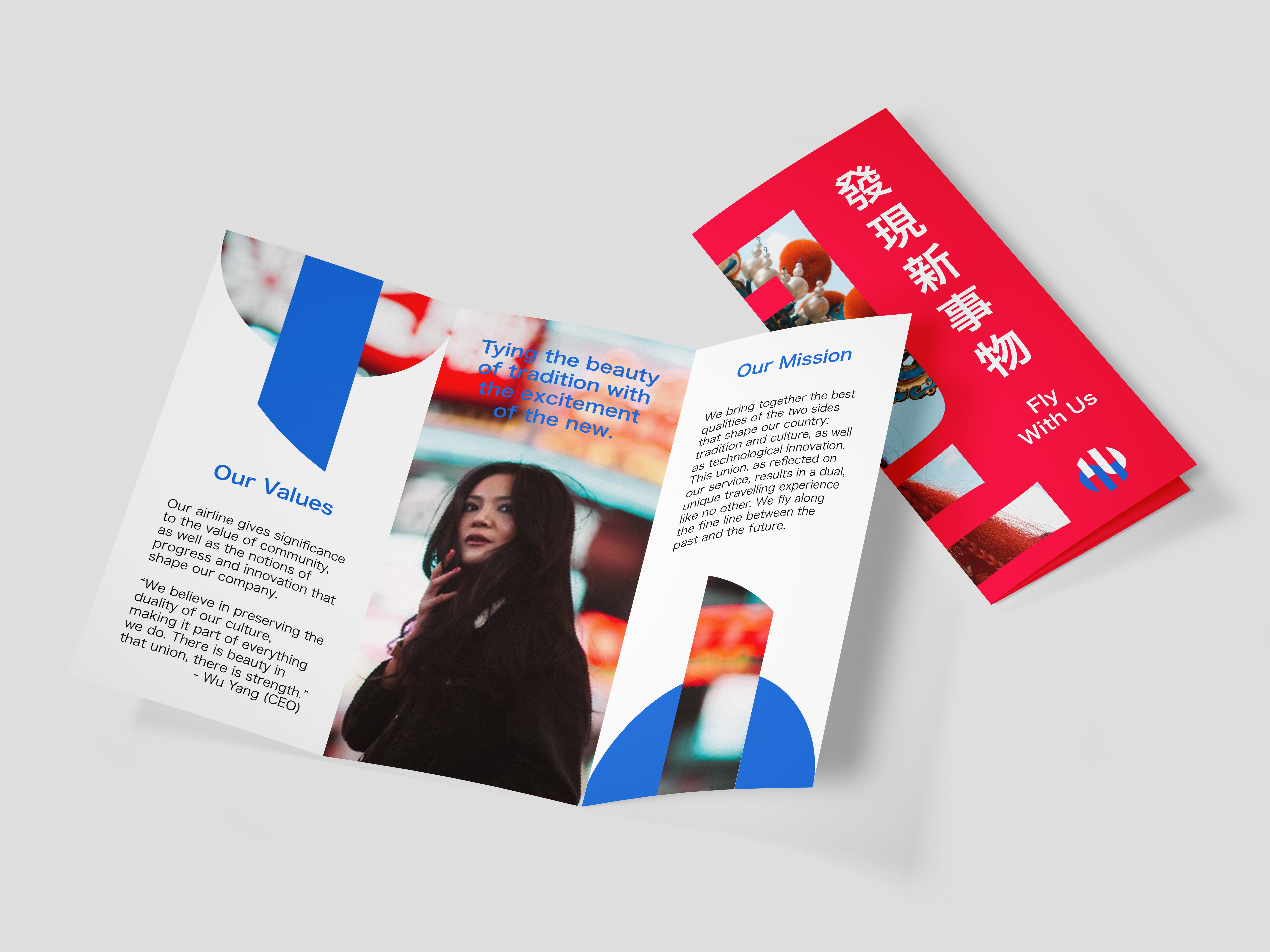
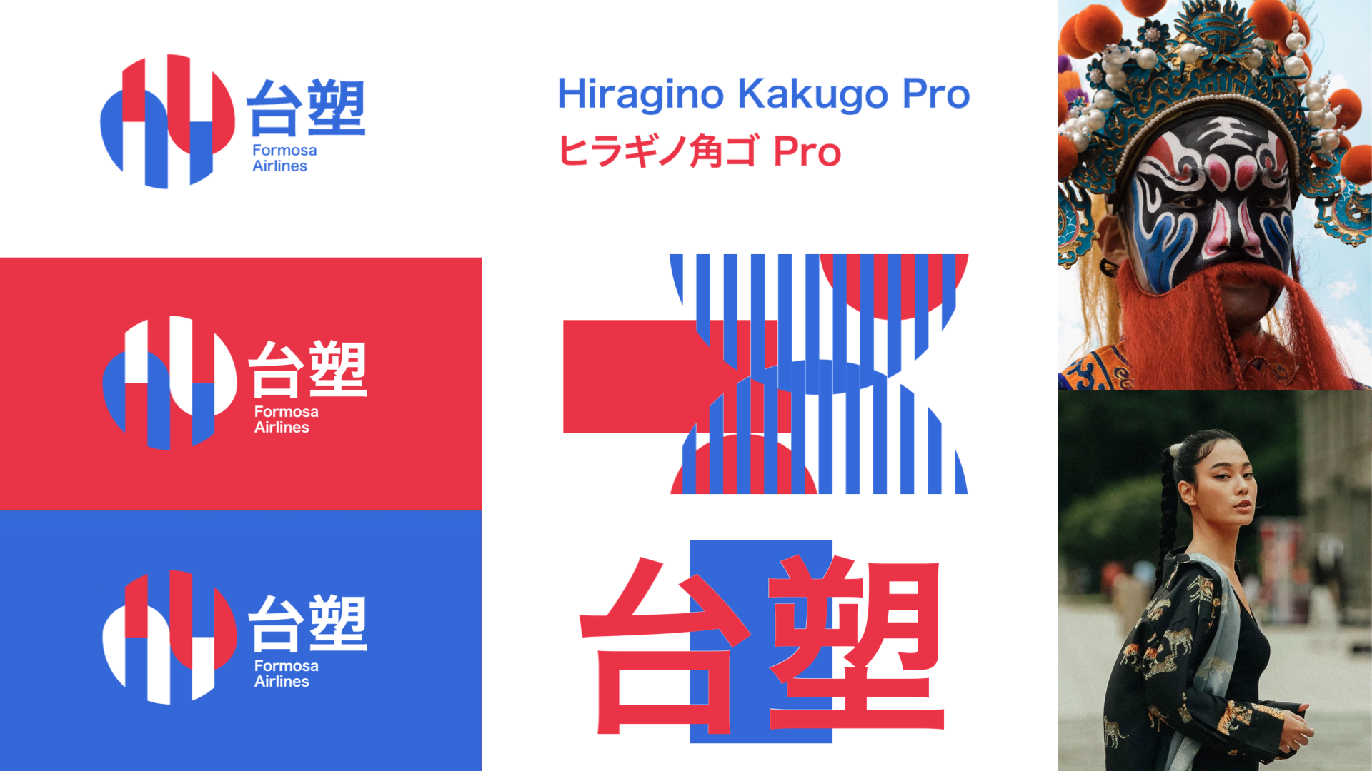
Our brand idea was derived from our country’s ideated essence: the duality between tradition and innovation. The warmth of tradition, as expressed through the color red, is complemented by the cool, blue expression of technology. These two sides are then unified under a single, neutral typeface: Hiragino Kaku Gothic Pro.
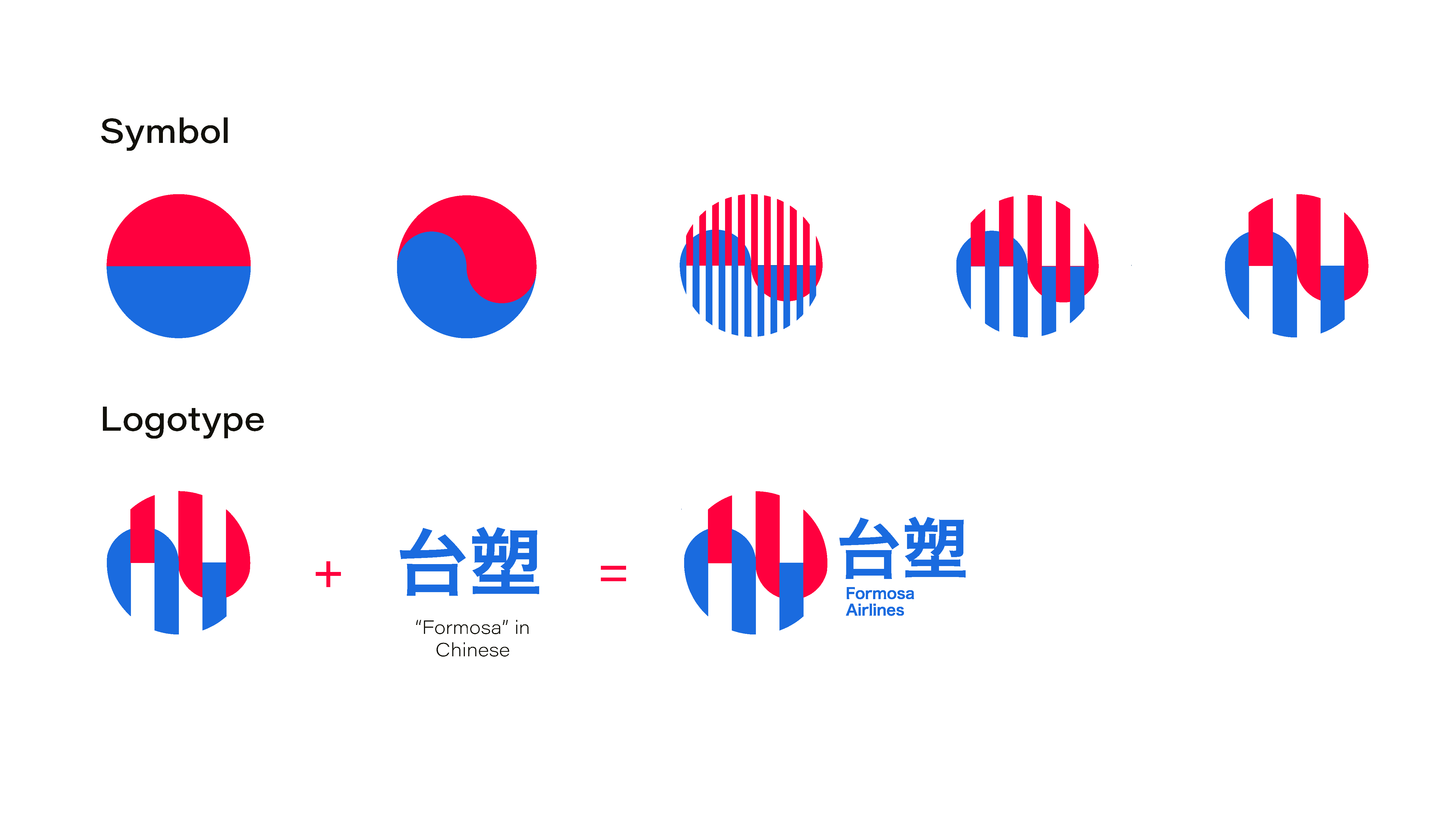
Additionally, the repeated use of the symbol of the circle draws inspiration from the Ying and Yang in expressing the unity between two halves of the same whole.
This is how Formosa Airlines came to be, named in homage to the heritage of the region.
//The Logo
//Visual System Summary
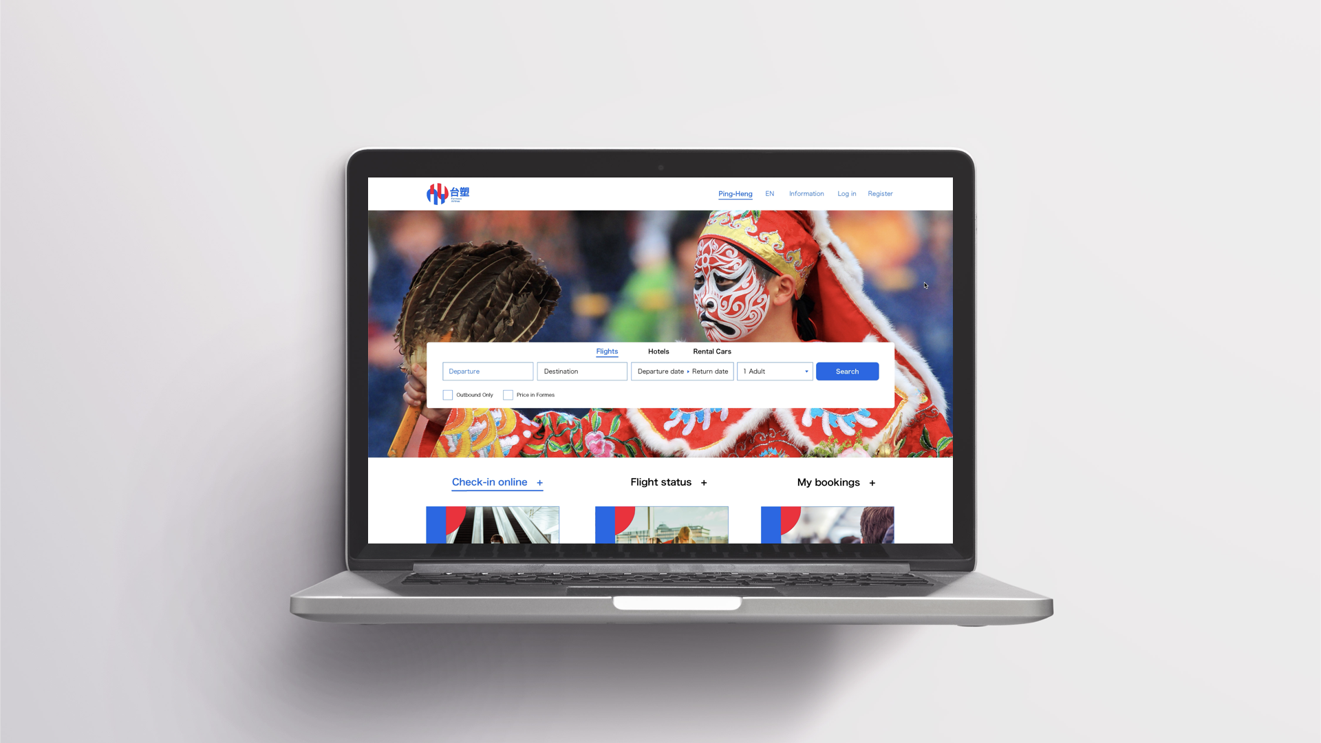
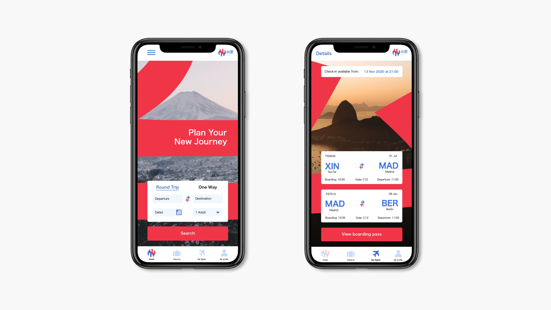
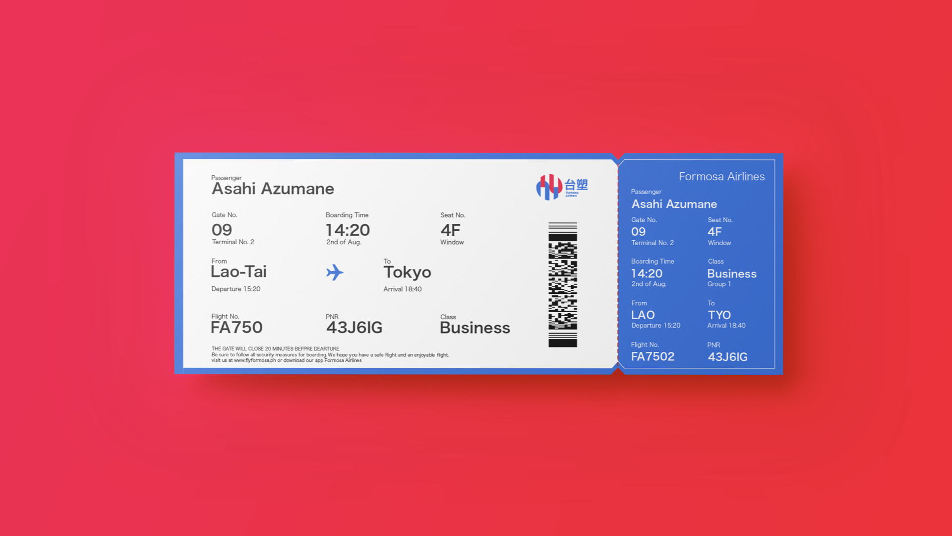
//Identity Touchpoints
